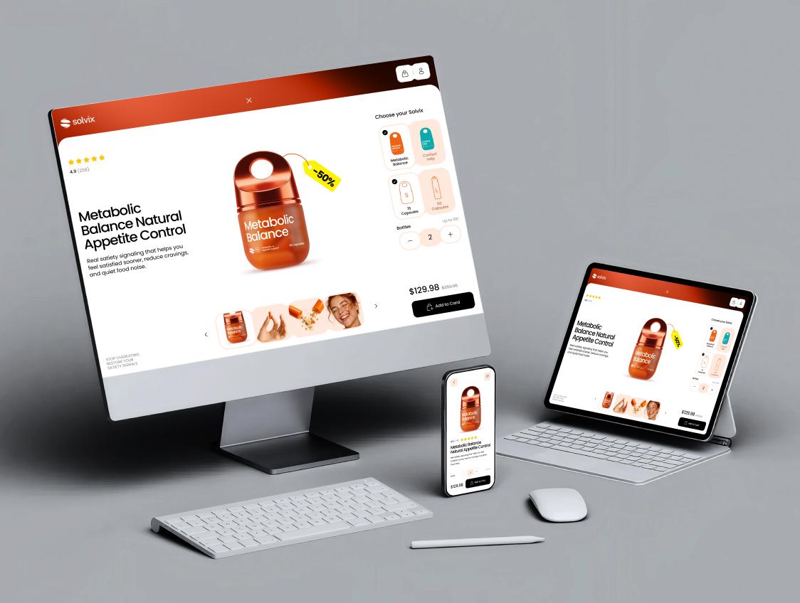
How to Hire a Responsive Web Design Agency: Pricing & Process
Learn how to choose a responsive web design agency for your SaaS or B2B website. This guide covers mobile-first UX, accessibility, performance, design systems, pricing and the questions to ask before starting a web redesign.
Having a website that converts is much harder than simply resizing your desktop site for a mobile device. People have access to so many different screens these days whether it be a large desktop monitor, laptop, tablet, phone etc. There are more screen sizes than you can imagine. Since over 60% of the world’s internet usage comes from mobile you want to make sure your digital product can be accessed on these devices.
Having a B2B/SaaS platform that isn’t mobile friendly will cost you. More bounce rate, decreased google ranking because of mobile first indexing. Decreased conversion rate and pipeline. Working with a Responsive Web Design Agency will ensure your site looks great on all devices and loads at a snappy speed.
Below I will outline what to look for when working with a responsive web design company. Technical aspects to know about, how to evaluate an agency and how they should go about their process. As well as pricing you can expect.
The Shift to Mobile-First Architecture
Historically when companies would develop their website they would take the desktop version and degrade it down to fit the mobile screen. As you can imagine this would result in bad user experience on the mobile device. Whether its a hidden menu bar or tables that don’t display correctly or even slow load times. Responsive Web Design allows us to create Mobile First Progressive Enhancement. We take our mobile screen size and try to better the user experience on that platform. Once we have perfected the mobile version we can expand it to the desktop and add additional graphics, hover effects and more content to help drive users towards CTA’s.
Technical Benchmarks of High-Performing Responsive Sites
Before hiring a team, it is important to understand the core technical requirements that separate a generic, template-driven website from a custom, production-grade responsive web application.
1. Fluid Grids & Breakpoint Architecture
Modern responsive design relies on fluid CSS grids, flexible flexbox structures, dynamic clamp functions, and scalable typography rather than static pixel measurements. Standard viewport breakpoints must be explicitly designed and engineered:
- Mobile Viewports (320px – 480px): Single-column layouts, sticky bottom CTAs, drawer navigation, and touch-optimized padding (minimum 44x44px hit targets).
- Tablets & Small Laptops (768px – 1024px): Two-to-three column adaptive grids, collapsible sidebars, and hybrid touch/cursor interaction models.
- Standard Desktops (1200px – 1440px): Multi-column content hierarchies, rich hover interactions, fixed side navigation, and interactive visual components.
- Ultra-Wide Displays (1920px+): Max-width content containers, ambient background extensions, and high-density data layouts that prevent unnatural stretching.
2. 60 FPS Visual Smoothness & GPU Acceleration
Scroll triggers, interactive micro-animations, and screen transitions must render at a consistent 60 FPS. Leading web design studios achieve this by utilizing hardware acceleration—animating strictly transform and opacity properties—to prevent layout reflows and keep heavy computations on the GPU rather than draining CPU cycles on mobile devices.
3. Web Accessibility (WCAG 2.2 AA Compliance)
Make sure your website is accessible to everyone no matter what device they may use. Making sure your website follows WCAG 2.2 AA will ensure your site has good color contrast ratio of at least 4.5:1. All ui elements should be keyboard navigable, screen reader friendly and have alternative options for users who dont enjoy large amounts of scroll animations (prefers-reduced-motion).
5-Step Process for Hiring the Right Agency
Evaluating an agency requires looking far beyond polished static portfolio shots on Dribbble or Behance. Follow this structured roadmap during your selection process:
Step 1: See Their Mobile Work In Person
Have them show you examples of their mobile work not just on a desktop screen. You should open up clients websites on your phone and see what happens when they convert to mobile. Do the nav bars become mobile friendly? Are data heavy tables able to be read on a smaller screen. How fast are the images loading and do they feel comfortable when touching them with your fingers.
Step 2: Look At Their Design Systems
They should know how to create global style guides and design systems with variables in figma. Having variables and styles built into a design system will help your developers when creating new pages and keep everything consistent.
Step 3: Make Sure They Know About Touch Fallbacks
If there is a large amount of hover states or webgl animations they need to have a touch fallback for mobile devices. Have them show you how their design translates to a smaller screen. There should be no clunky hover effects on your phones screen that may cause CLS or drain your batteries.
Step 4: Understand Their Development Knowledge
Having great designs in figma means nothing if the front end developers cant build what was designed. Make sure your agency knows how to write clean code whether its using next.js, webflow or tailwind css.
Step 5: They Should Provide All Services
You don’t want to hire one company that only does static design and then outsource your front end developers to another company. Make sure they can provide all these services. From brand strategy, UX/UI design, Interactive motion and animations, Front end development, Testing and support after your website goes live.
Responsive Web Design Pricing & Scope Models
Understanding standard investment tiers in the US and global market helps executives plan budgets effectively, avoid low-quality templates, and prevent scope creep.
| Agency Category | Indicative Budget | Scope & Key Deliverables | Best Suited For |
|---|---|---|---|
| Freelance / Solo Developer | $3,000 – $8,000 | Custom website or product design, focused development scope, direct communication with one specialist. The final result depends on the freelancer’s specific expertise and capacity. | Focused projects, MVPs, landing pages, and businesses that need one clearly defined design or development task. Complex 3D/WebGL, advanced motion, multi-role UX, and large technical builds may require several specialists working together. |
| Bespoke Product Agency (e.g., Nixtio) | $10,000 – $90,000 | Custom mobile-first UI/UX, tokenized Figma design systems, 60 FPS motion, interactive WebGL/3D, custom CMS integration, full frontend development & cross-device QA. | SaaS scale-ups, B2B startups, and brands requiring high conversion velocity and custom identity. |
| Enterprise Digital Agency | $100,000 – $300,000+ | Multi-site enterprise architectures, custom headless CMS builds, multi-language localization, complex API integrations, and global security compliance. | Fortune 500 companies, large media outlets, and complex multi-brand ecosystems. |
Common Pitfalls When Hiring a Web Design Partner
- Judging Quality Solely on Desktop Mockups: Desktop designs look impressive in client presentations, but over half of your actual leads will evaluate your site on a mobile device. Always demand mobile wireframes and interactive prototypes upfront.
- Ignoring Core Web Vitals & Page Speed: A site with heavy video backgrounds and uncompressed assets may look beautiful, but if it takes 5 seconds to load on mobile 4G networks, search engines will demote your ranking and users will bounce.
- Treating Mobile Responsive Design as an Afterthought: Adding mobile tweaks at the end of a project results in broken layouts and awkward text wrapping. Mobile responsiveness must be integrated into every step of the wireframing phase.
- Separating Design from Development: When design and code are handled by different vendors, miscommunication frequently leads to broken animations, missing hover states, and poor performance optimization.
Scale Your Web Experience with Nixtio
Nixtio specializes in beautiful digital experiences that help drive sales on your front end. From creating your brands visual identity to responsive UX/UI design. Animations, 3D and web development we tie it all together. Ensuring no quality is lost from your wireframe to live product.
Responsive Mobile First Websites that grab your users attention. Help them understand what you have to offer and help turn them into paying customers on any screen size.
Want To Create A High Converting Responsive Website? Request a Custom Web Design Quote with Nixtio Today and we will provide you with an audit and road map.
Build Your Next Product With Nixtio
A SaaS company should not need a different contractor for its brand, product, website, and motion work. Separate teams can leave you with an impressive site that feels disconnected from the product, or a design system that cannot grow with you.
Nixtio brings brand, UX/UI, websites, web apps, development, 3D, motion, and launch support together. Tell us what you are building next.